
One look, one home: docs on the website, and a new face for the console and sign-in
The documentation now lives on the website, so the product pages, the blog and the reference are in one place. And the console and the sign-in portal have been rebuilt to match: the same typeface, the same colors, the same flat, quiet look in light and dark.
Picture a normal Tuesday. You read about a feature on the website, follow a link into the docs, open the console to try it, and get bounced through a sign-in page on the way. Four stops. Until today, it felt like four different products.
It doesn’t any more.
The docs moved in
Every guide, the Terraform reference and the API reference now sit at clusternest.com/docs, under the same navigation bar as the rest of the site.
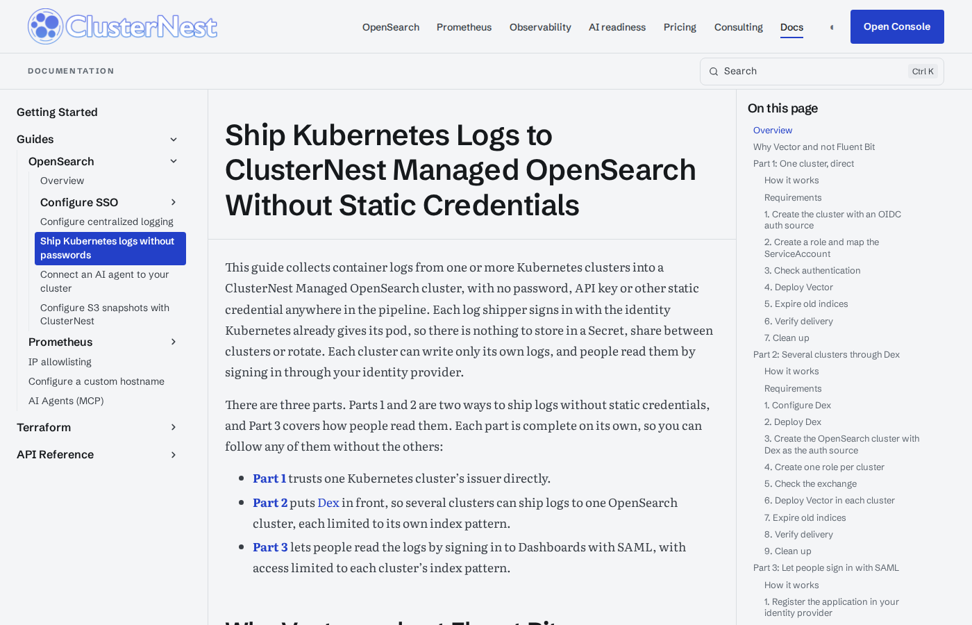
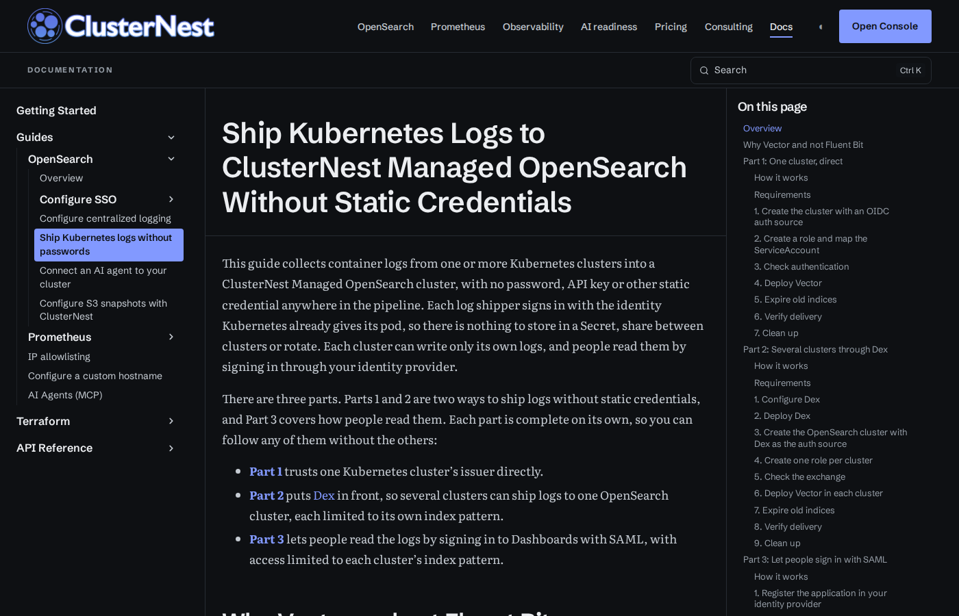
What that buys you:
- No more second site. The docs carry the website’s navigation, footer, typography and theme toggle. Pick dark once and it stays dark from the pricing page to the last step of a guide.
- One search for everything. Press
Ctrl Kand search the guides and the blog together. The answer to “how do I ship logs without a password” might be a guide or a post, and now you don’t have to know which. - Guides and posts link to each other freely. A release announcement can point at the exact step it is about, on the same host, and the guide can point back at the story behind it.
Nothing you have saved breaks. Links to docs.clusternest.com redirect to the matching page under clusternest.com/docs, so the bookmarks, the runbooks and the Slack messages keep working.
A console that looks like us
The console has been rebuilt on the same design system as the website. Same typeface. Same cool neutrals and the same ultramarine accent. Flat surfaces with one-pixel borders instead of shadows, and tight 4px corners.
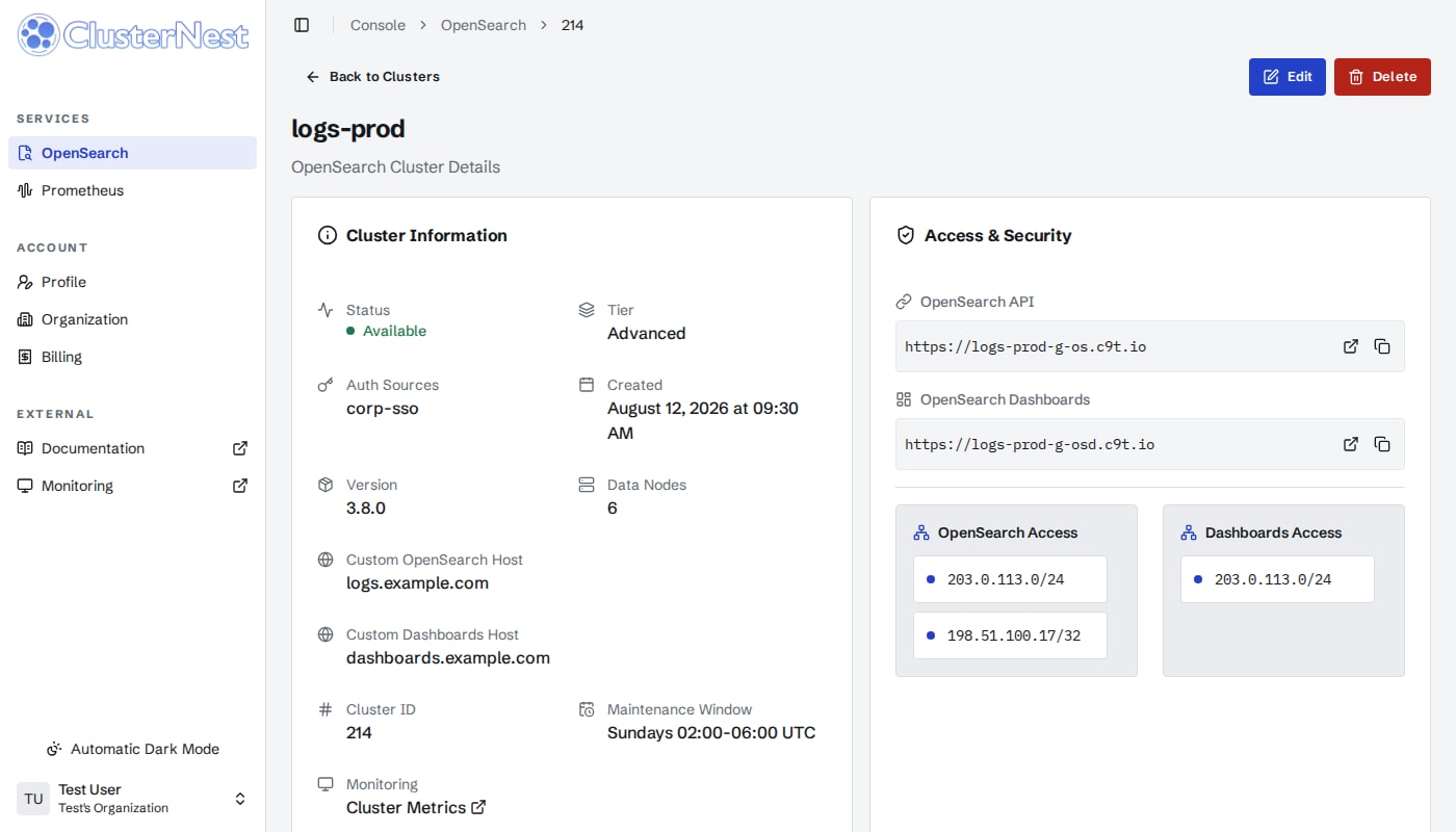
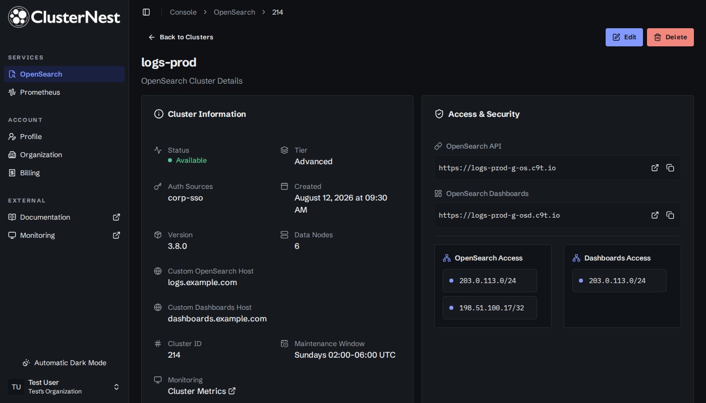
The change is about calm, not decoration. Status colors are now a small, consistent set, so a green, an amber and a red mean the same thing on every page. Labels, tables and monospace values (hostnames, IDs, CIDR ranges) follow one set of rules. Light and dark are two full themes rather than one inverted, and the console follows your system setting unless you choose otherwise.
Nothing about how it works changed. Every page, form and action is where you left it.
And the sign-in page
The first thing most people see is not the console. It’s the sign-in. That page, and the account settings behind it where you manage security keys, app passwords and sessions, now wear the same look.
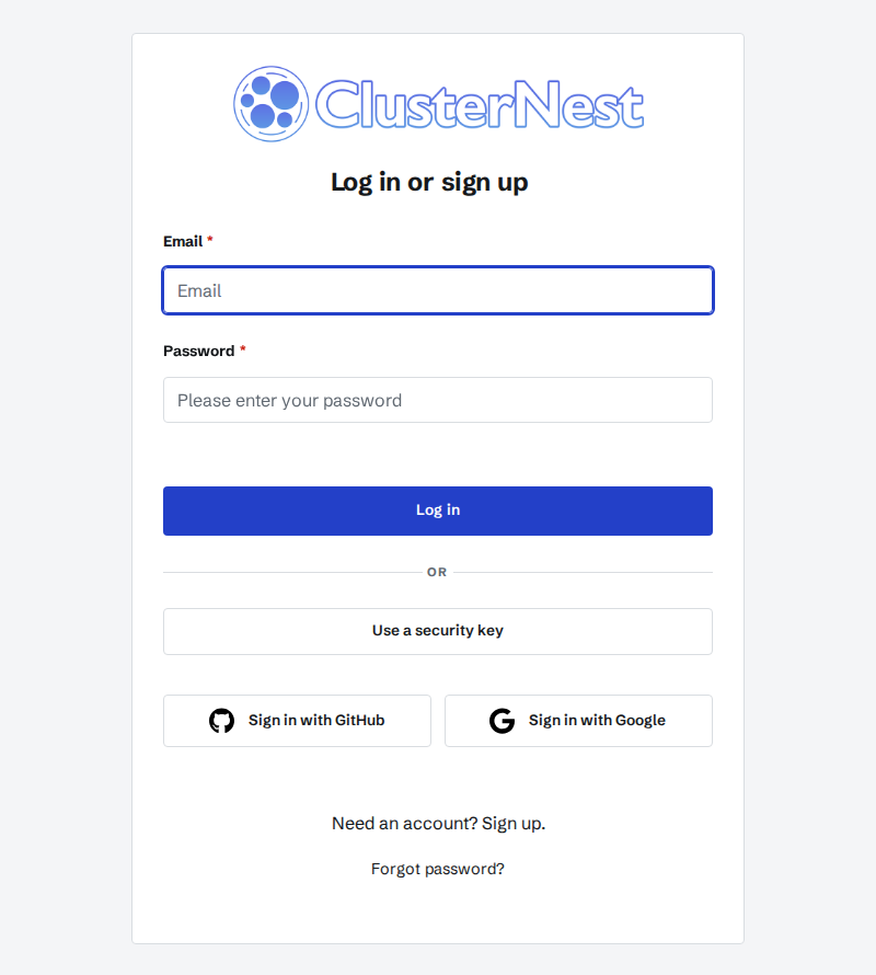
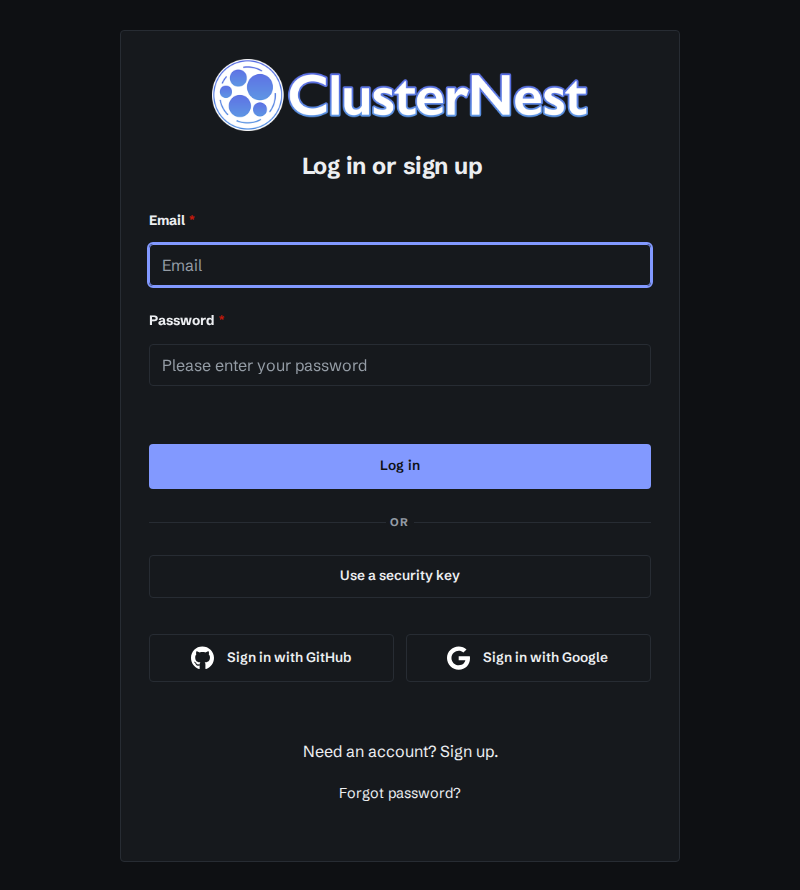
It’s the same sign-in with the same options, now in the same typeface and colors as the page you came from and the console you’re headed to. It follows your system’s light or dark setting too.
Take a look
Open the docs, then the console. If something looks off in either theme, or you can’t find a page that used to be where you remember, tell us at [email protected].